
Stress Duration Chart Guide
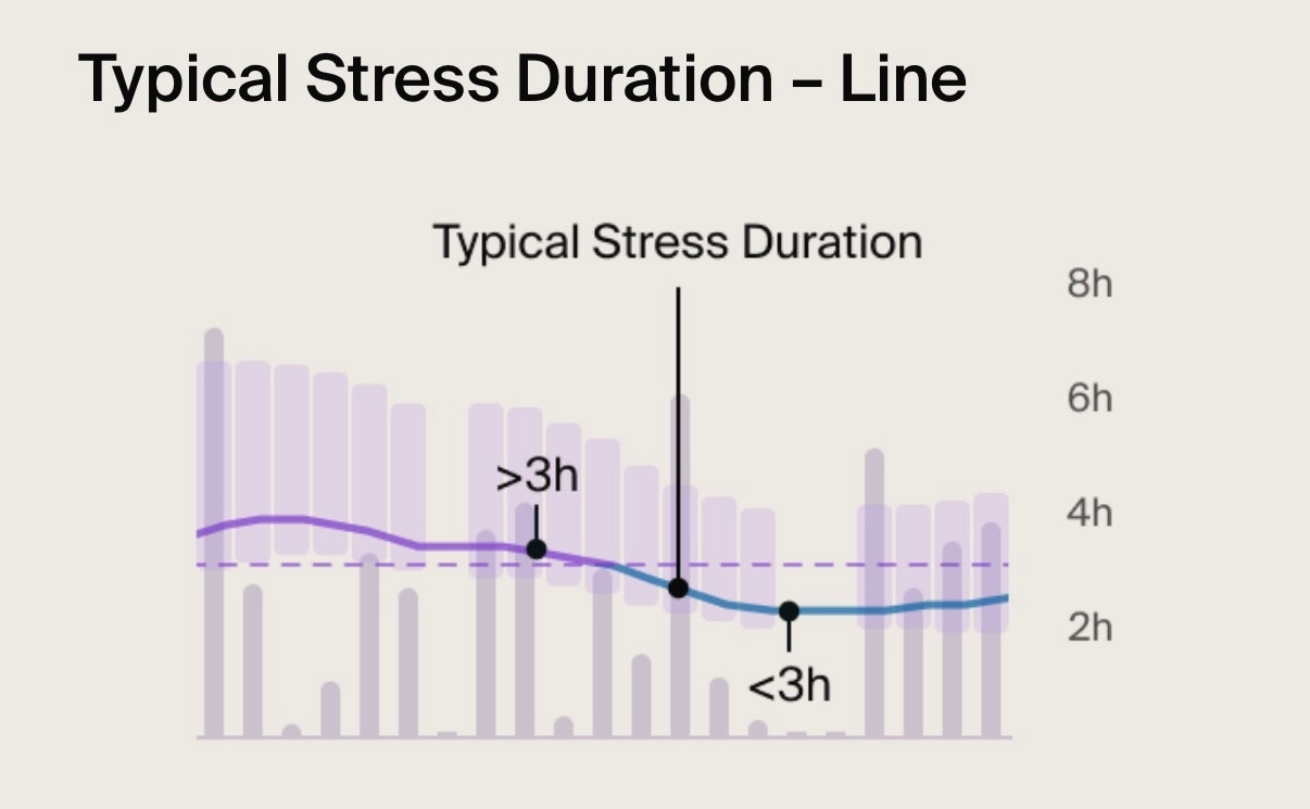
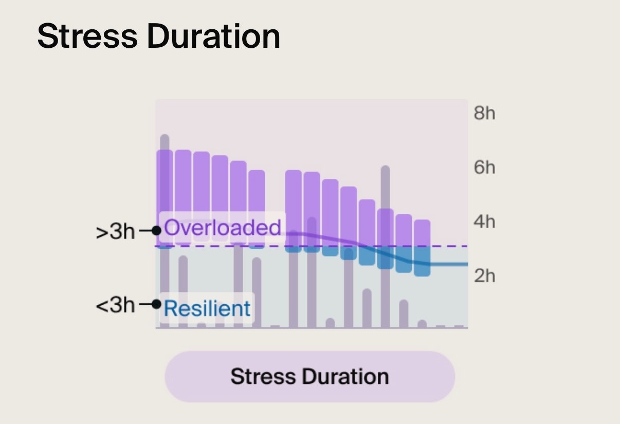
Blue area: Resilient. You’ve been handling daily demands well lately. This is when your stress duration is less than 3 hours.
Purple area: Overloaded. Your body might be under added pressure lately. This is when your stress duration lasts over 3 hours.
Grey bars: Show your Daily Stress Duration.
Under 3 hours > You’re handling daily demands well.
Over 3 hours > Your body might be struggling to keep up with daily demands.
Purple line: Represents your Typical Stress Duration.
Typical is low (blue line) > You’re handling daily demands well.
Typical is high (purple line) > You’re body may be under more pressure than it can handle. Note: This is the key part of the chart to keep an eye on.
Purple line: Represents your Typical Stress Duration. A high typical indicates your body might be under more pressure than it can handle, while a low typical may signal fatigue or lack of motivation. Note: This is the key part of the chart to keep an eye on.
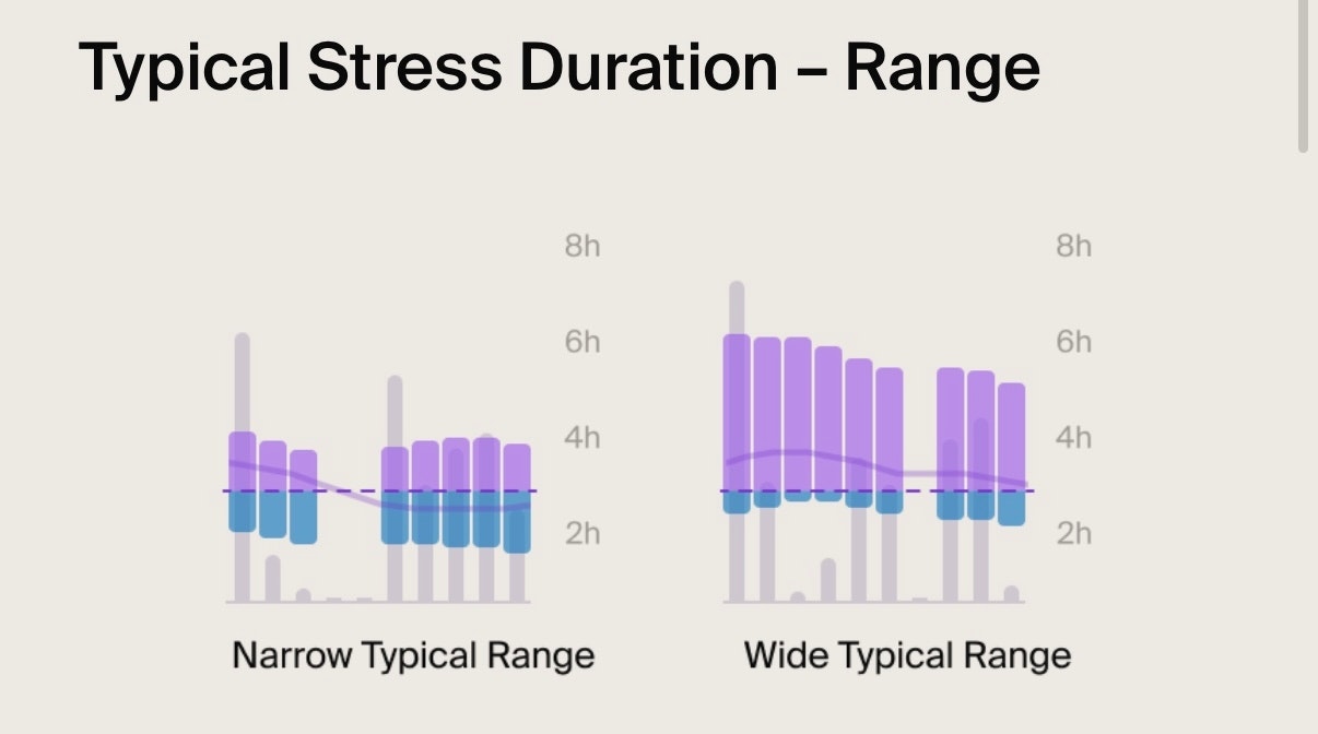
Purple bars: Represent your Typical Range. It shows how much your Daily Stress Duration varies day-to-day.
Narrow range: Means consistent Stress Duration, indicating your body handles daily challenges well and supports better health.
Wide range: Means fluctuating Stress Duration, which may suggest your body needs extra support for better health.
Reflection: Tap any bar for a personalized daily reflection.
Discover what Stress Duration means here.

Stress Recovery & Frequency Chart Guide
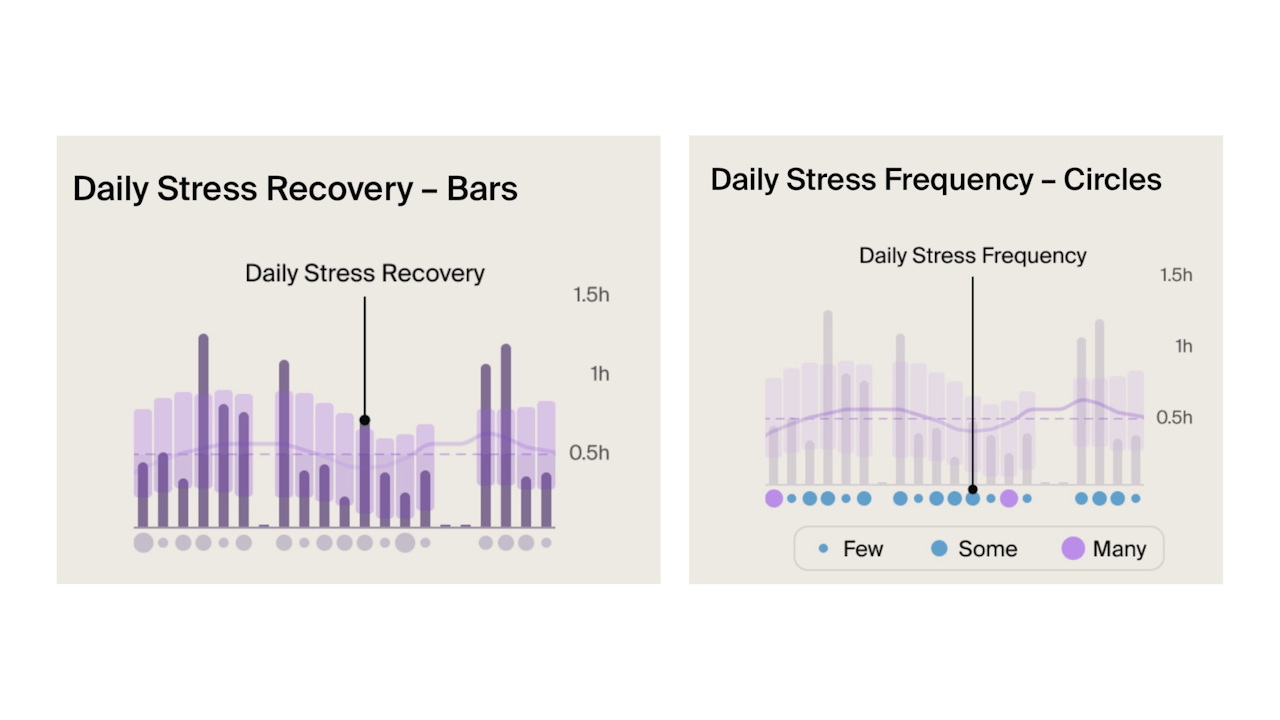
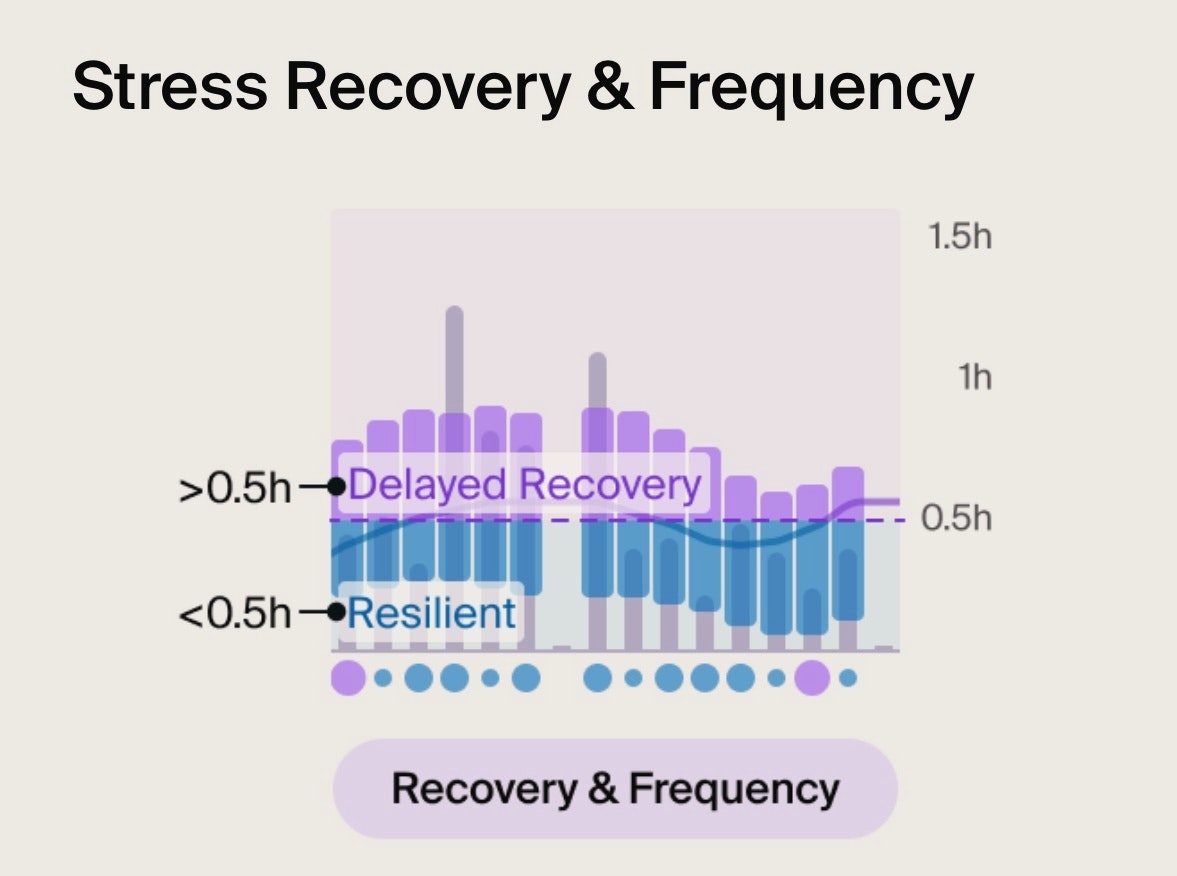
Blue area: Resilient. You’re bouncing back quickly from daily stressors. It takes you less than 30 minutes.
Purple area: Delayed recovery. You may be struggling to return to Homeostasis, and bouncing back takes you more than 30 minutes.
Grey bars: Show Daily Stress Recovery.
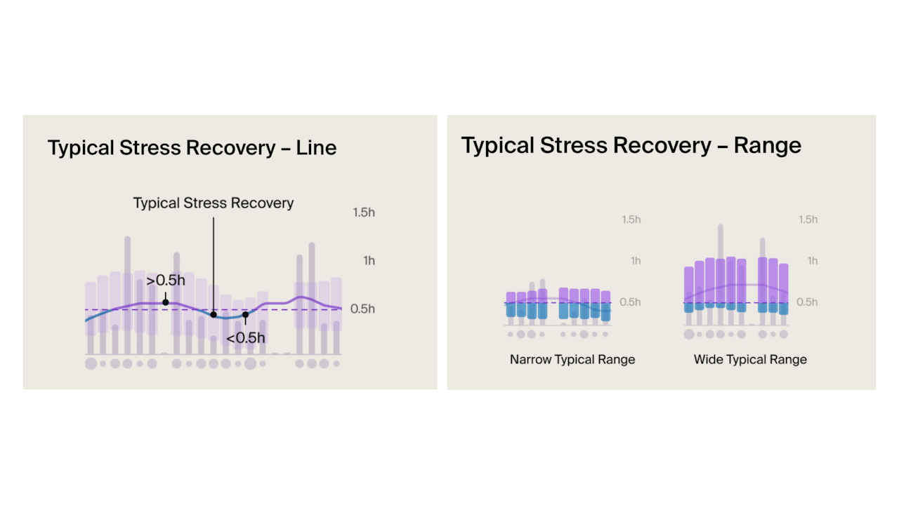
Line: Represents your Typical Stress Recovery, which shows changes over time.
A low typical (blue line): You’re bouncing back quickly from daily stressors. It takes you less than 30 minutes.
A high typical (purple line): Delayed recovery. Bouncing back from daily stressors takes you more than 30 minutes.
Purple and blue bars: Indicate your Typical Stress Recovery Range. The proportion of the colors in each bar can show if your recovery is typically quick (mostly blue) or delayed (mostly purple). Over time, you may notice this range becoming narrower or wider.
Narrower: Means consistent recovery, which is a good sign.
Wider: Means inconsistent recovery, indicating your body may struggle to maintain balance and is more sensitive to stress.
Circles at the bottom: Represent Daily Stress Frequency.
Few (small circles): Low Stress Frequency (less than 3 stress responses).
Some (medium circles): Medium Stress Frequency (3 to 5 stress responses).
Many (large circles): High Stress Frequency (6 or more stress responses). This doesn’t necessarily mean more stressful events; it could indicate heightened sensitivity to stress at that time.
If you are consistently experiencing stress over 4 times a day, this could be a sign of stress sensitivity.
Discover what Stress Recovery & Frequency mean here.

Intense Activity Chart Guide
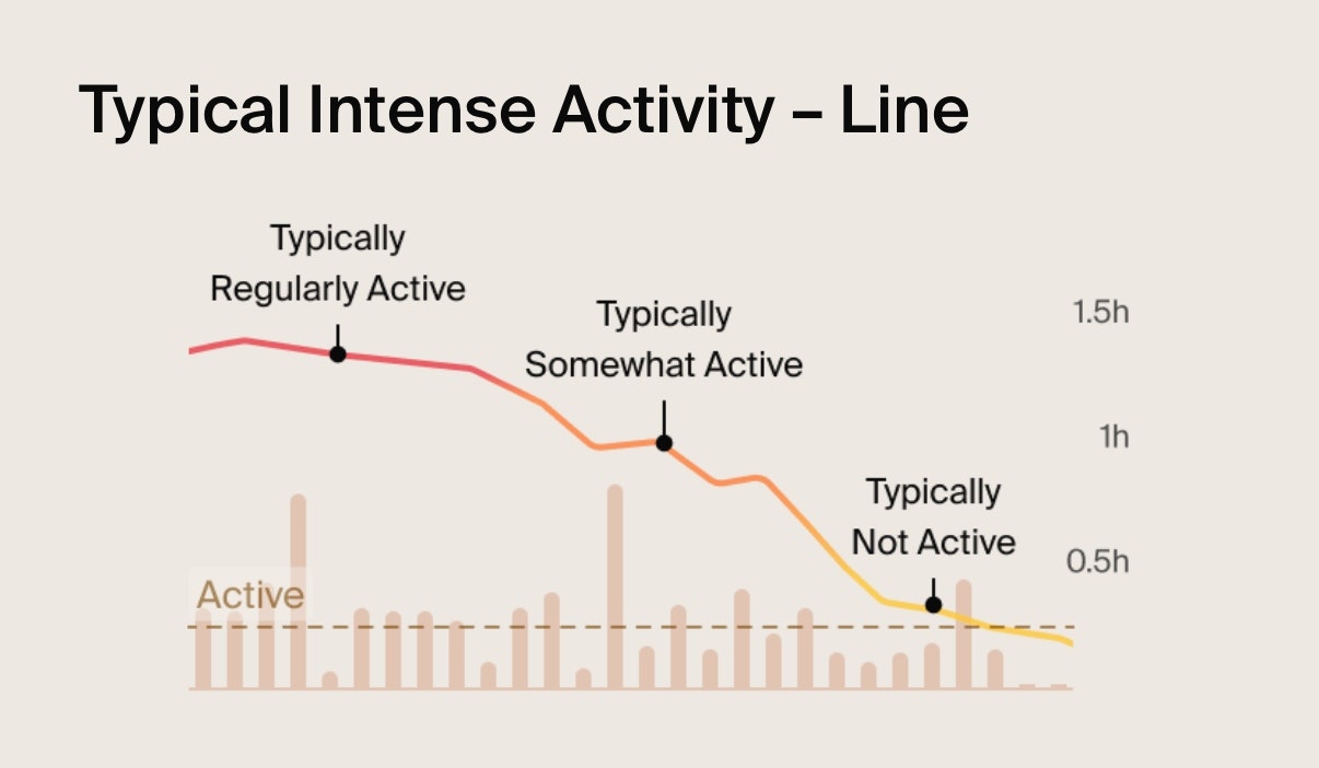
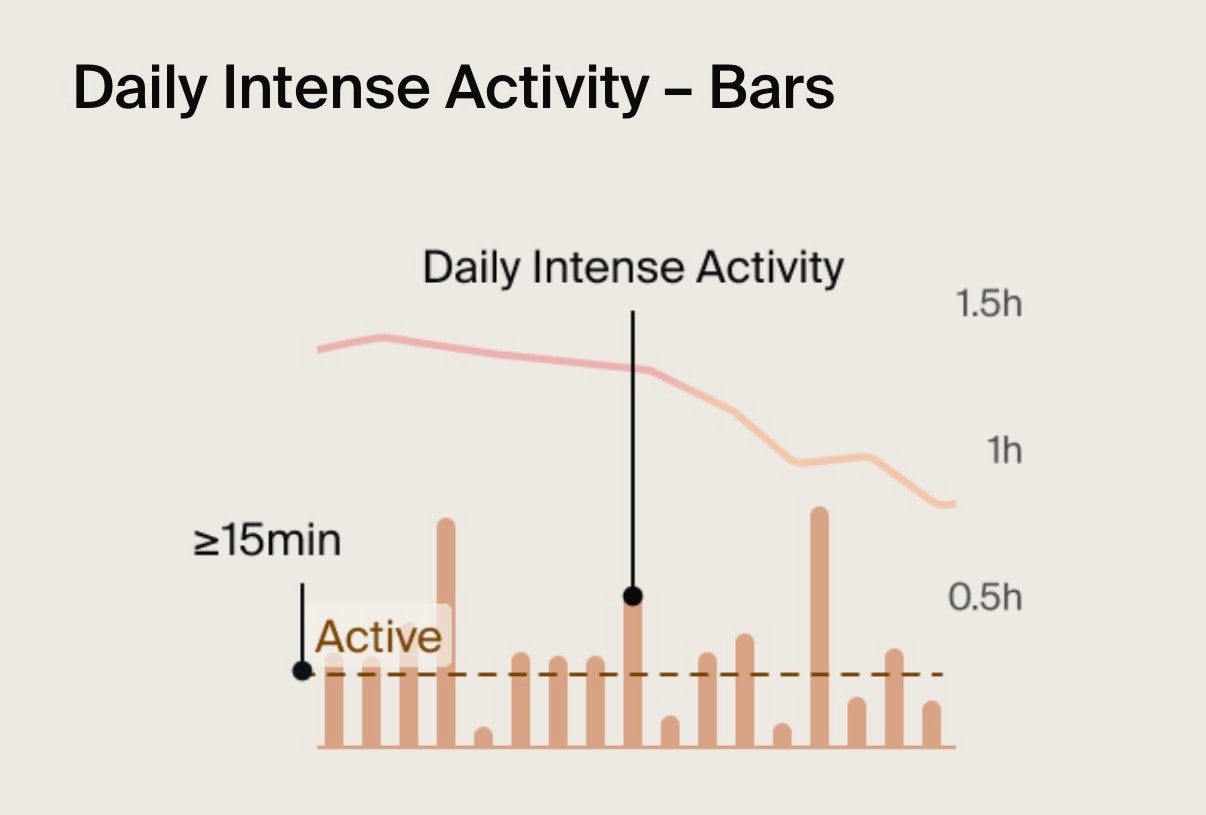
Orange bars: Represent the duration of time spent doing intense activity each day.
Dashed line: Active. This is the 15-minute threshold for a day to be considered an active day.
Line: Represents your Typical Intense Activity. It helps you identify how consistent you’ve been. Here's what it shows:
Typically Regularity Active (red line): You're hitting at least 15 minutes of activity on most days and consistently, 4 to 5 times a week.
Typically Somewhat Active (orange line): You’re active but not always consistent.
Typically not Active (yellow line): You're doing less than 15 minutes of intense activity most days, missing out on key health benefits.
Discover what Intense Activity means here.

Resting Heart Rate (RHR) Chart Guide
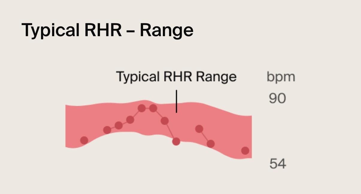
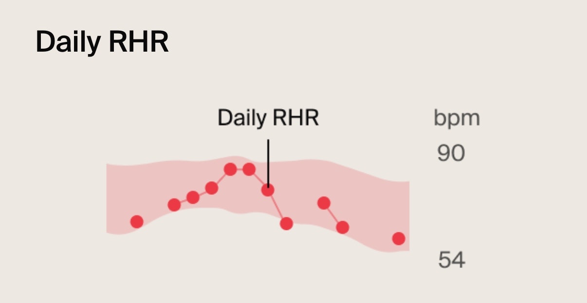
Red dots: Represent your Daily RHR, with consecutive days connected by a line.
Lower RHR: Reflects better cardiovascular health and fitness.
Higher RHR: Indicates that your body is under strain from stress, fatigue, or illness.
Highlighted red area: Represents your Typical RHR Range. This is what’s normal for your body when you’re feeling well. You can use it as your personal baseline to help recognise patterns.
Within or below this range: It means your body is working efficiently.
Above this range: It may be a sign your body needs extra care.
Discover what RHR means here.

Sleep Regularity Chart Guide
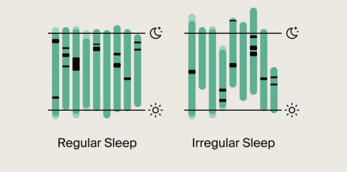
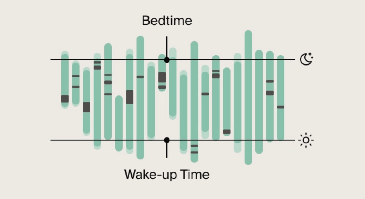
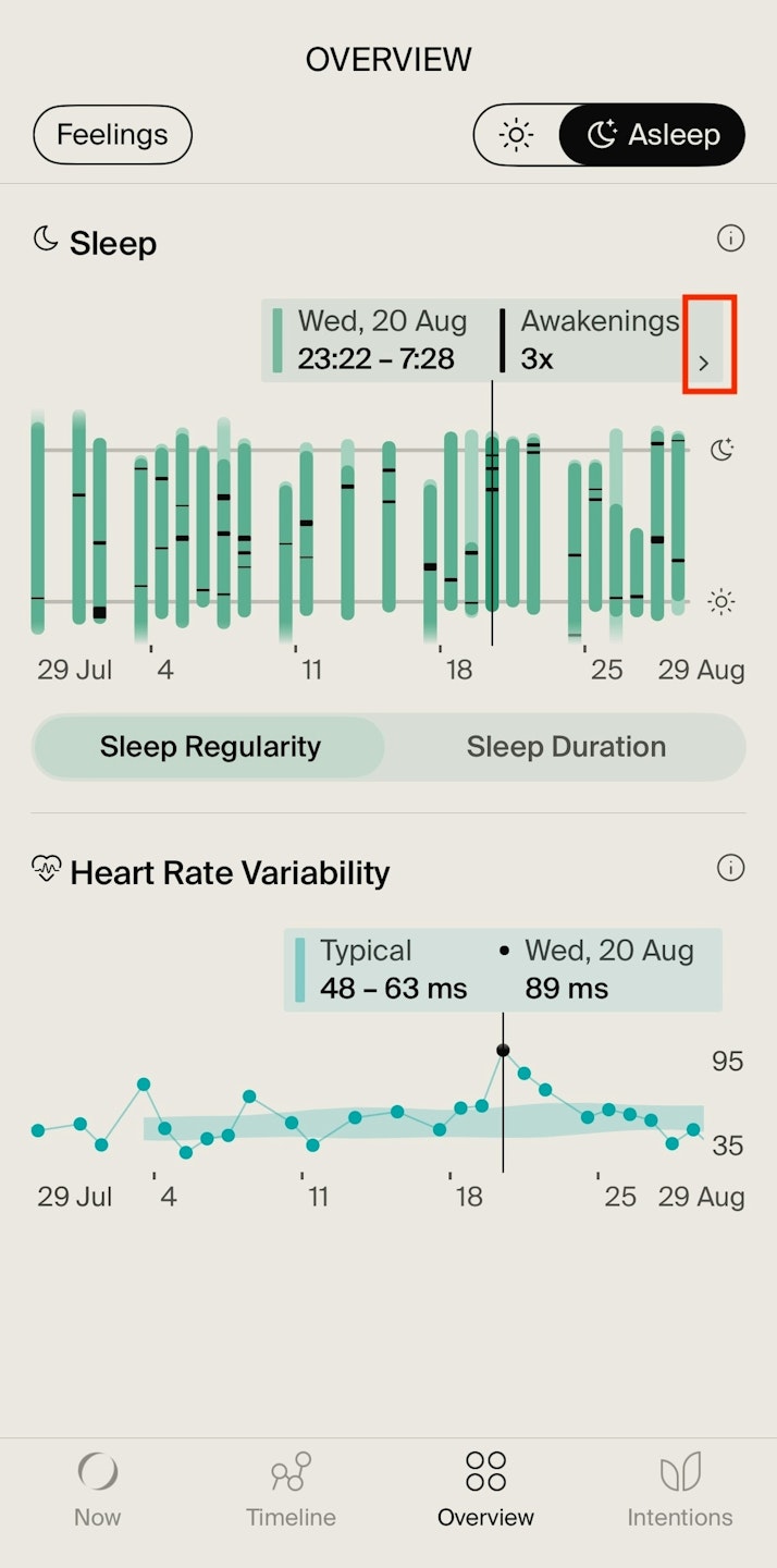
Green bars: Represent a night of sleep. When tapping on a bar you’ll see the time you went to sleep and woke up on the left and the awakening times on the right. Tap the small arrow next to the date to open a Sleep Summary for that night, where you can review details such as the sleep stage you woke up in and more (available on iOS devices only).
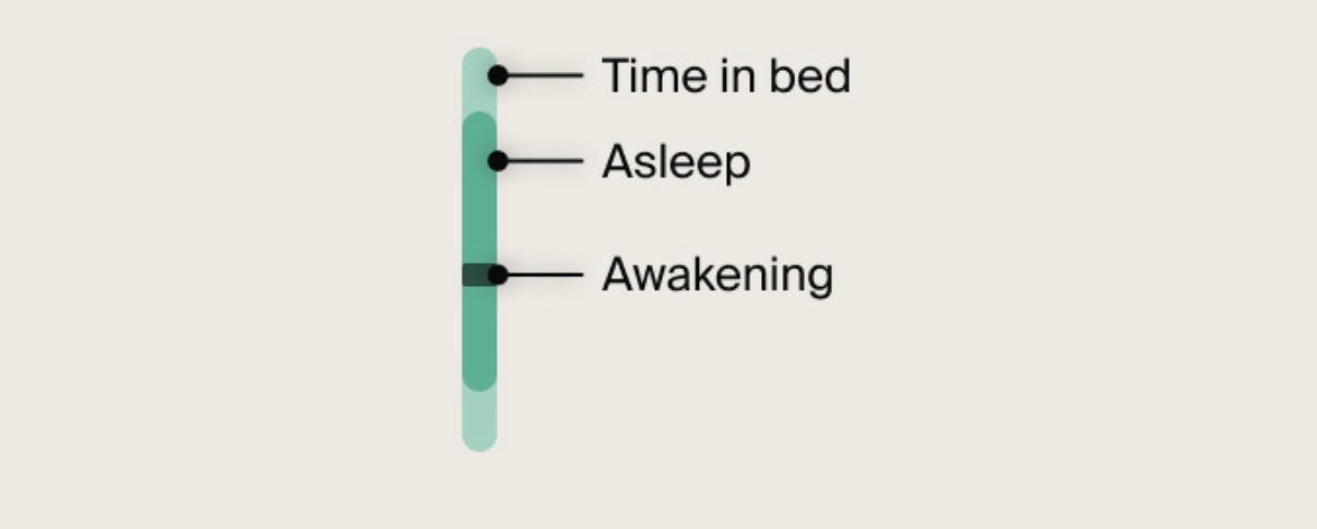
Dark green: Time in bed (not sleeping, but lying in bed)
Light green: Time asleep.
Dark lines show brief Awakenings (over 5 minutes) during sleep.
Line beside moon icon: Represents your typical bedtime, meaning when you usually go to sleep.
Line beside sun icon: Represents your typical wake-up time, meaning when you usually wake up.
Area between the moon and sun icon lines: Represent your Regularity Zone.
Regular sleep: Green bars are within the moon and sun icon lines.
Irregular sleep: Green bars are outside both icon lines.
Discover what Sleep Regularity means here.

Sleep Duration Chart Guide
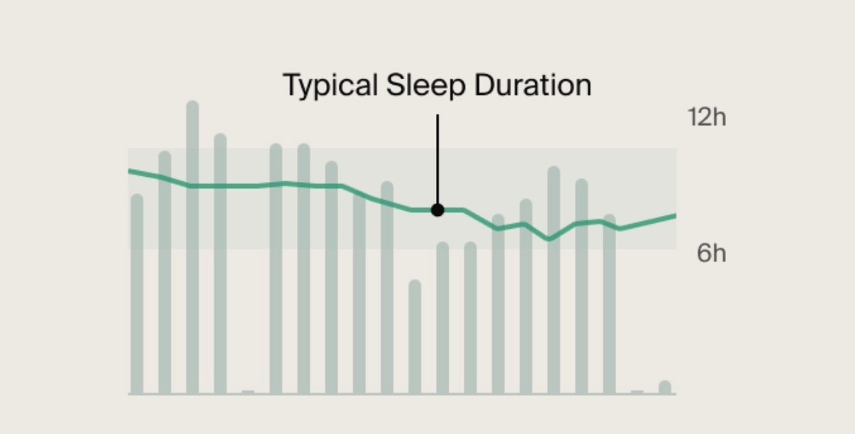
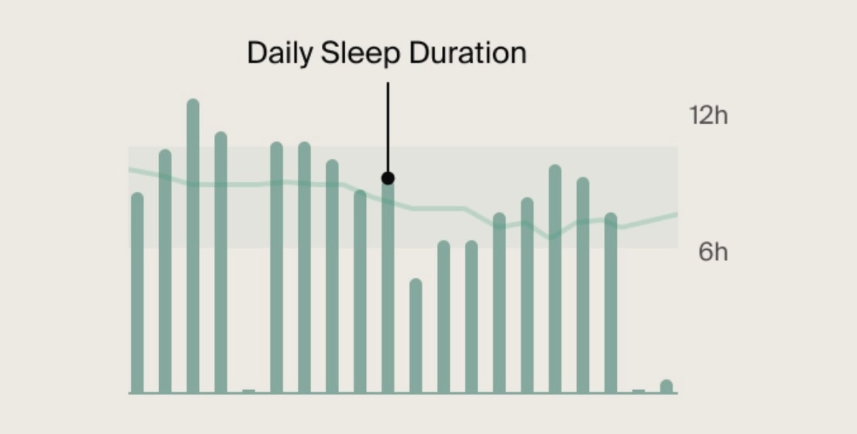
Grey bars: Represent how long you’ve slept each night. When tapping on a bar, you’ll see your Typical on the left and your Sleep Duration on the right.
Tap the small arrow next to the date to open a Sleep Summary for that night, where you can review details like the time spent on each sleep stage and more (available on iOS devices only).
Line: Represents your Typical Sleep Duration. This is your regular sleep pattern. Consistently getting too little or too much sleep can impact your health over time.
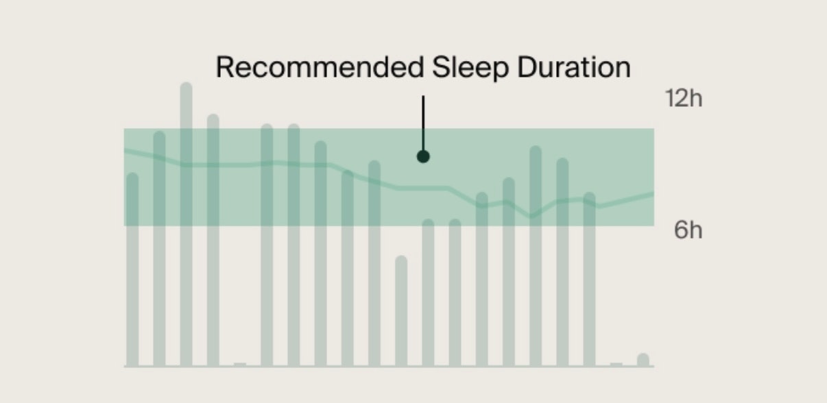
Highlighted area: Represents the recommended Sleep Duration range for your age, as suggested by the National Sleep Foundation:
18-25 years: 6-11 hours
26-64 years: 6-10 hours
65+ years: 5-9 hours
Discover what Sleep Duration means here.

Sleep Summary Screen
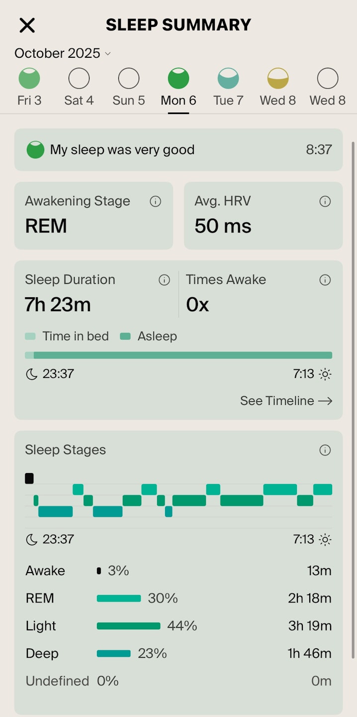
The Sleep Summary provides a detailed overview of your night, including how you slept, your sleep stages, awakenings, heart rate variability, and overall sleep duration.
At the moment, this screen is only available on iOS.
How to access it
Tap the Overview tab.
Select the moon icon at the top right corner (Asleep tab).
Under Sleep Regularity or Duration, tap any bar.
Tap the small arrow next to the date to open that night's Sleep Summary.
Insights Available
In the Sleep Summary screen, you’ll find:
Your self-reported sleep quality: Your answer to how you slept that night.
Awakening stage: The sleep stage you were in when you woke up.
Average Heart Rate Variability (HRV): The average variation in time between heartbeats while asleep.
Sleep Duration: The total amount of time you slept that night.
Times Awake: The number of times you woke up during the night.
Asleep and Time in bed: The dark green color shows the time you were asleep, while the light green color indicates the time you were lying in bed but not sleeping. If you see black (in light mode) or white (in dark mode), this represents the time you were awake.
Sleep Stages: Awake, REM, Light, Deep, and Undefined. Each stage is shown as a percentage and in total time. Colored bars indicate the time spent in each stage (the longer the bar, the longer you stayed in that stage).
Tap any date at the top of the screen to switch nights and view the corresponding insights.

Heart Rate Variability (HRV) Chart Guide
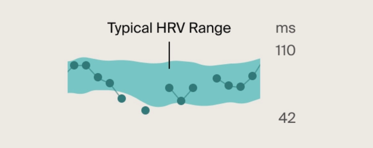
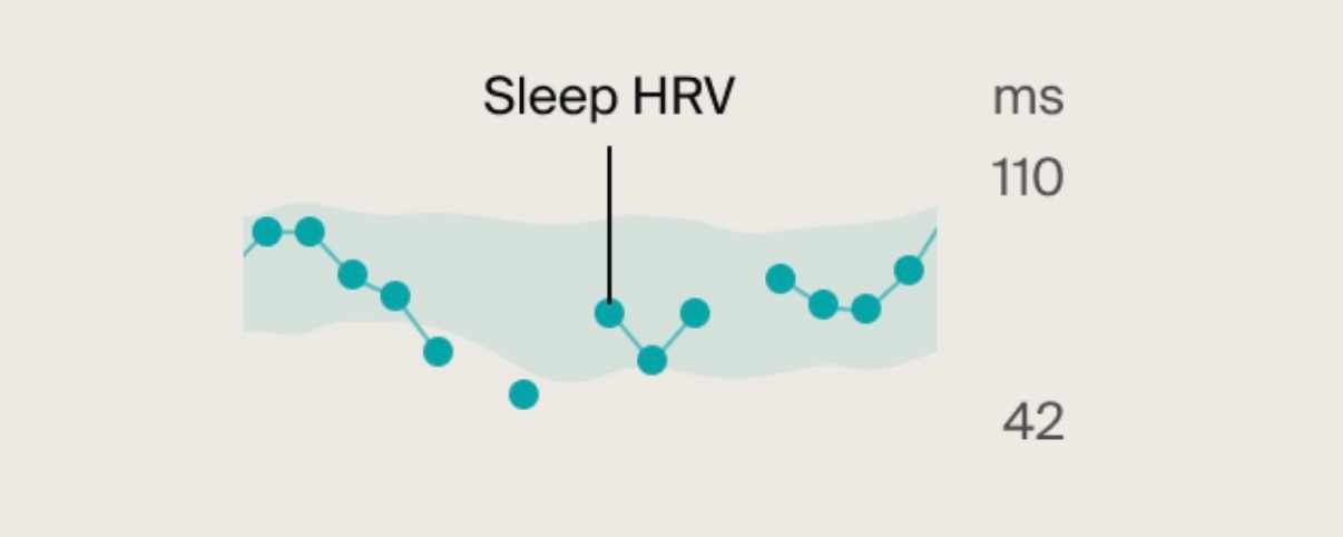
Blue dots: Represent HRV when you sleep. Consecutive nights are connected by a line.
Higher sleep HRV: Indicates your body recovered well overnight, leaving you mentally and physically ready for the day ahead.
Lower sleep HRV: Suggests your body is struggling to recover effectively.
Temporary dips in Sleep HRV are normal, but consistently low values may mean your body needs extra support. Consider resting more, improving sleep hygiene, managing stress, or adjusting your exercise.
Highlighted area: This is your Typical HRV Range, your personal baseline when your body is functioning well.
Tracking your Sleep HRV against your Typical Range helps you understand how well your body is recovering and recognize when you might need additional rest or support.
Keep in mind that HRV is highly individual - what's considered "low" for one person may be normal for another. The key is to observe patterns in your own HRV trends over time rather than comparing them to others.
Discover what Sleep HRV means here.

