
Helpful Icons and Features
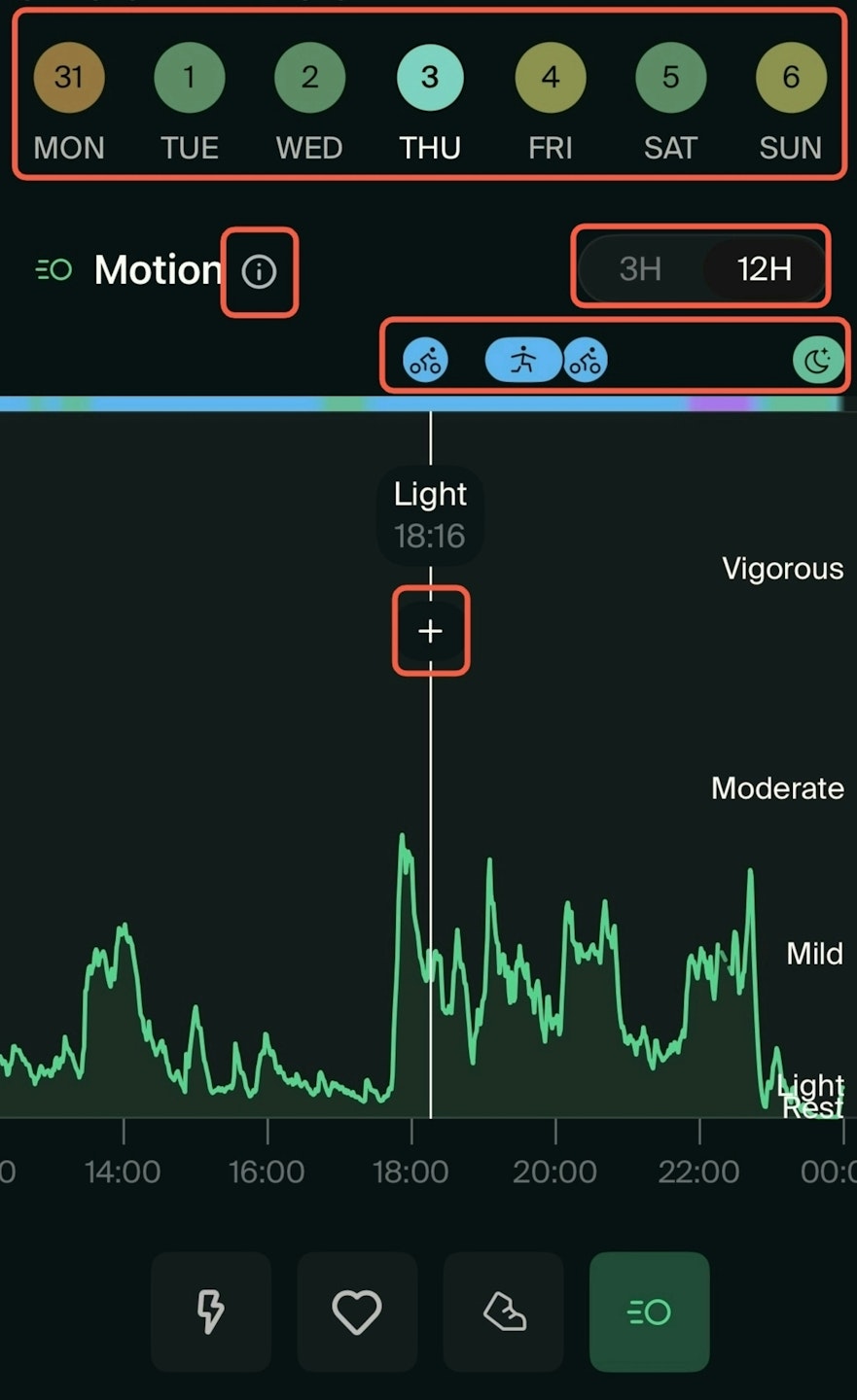
Colorful circles: The current month and dates are displayed at the top of the screen. At the end of each day, you’ll receive a “How was your day?” question in the app. The color of each date corresponds to your answer, reflecting how you felt throughout the day.
Info icon: Next to each metric name, you’ll see a small info (i) icon. Tap it to learn more about that specific metric.
3H / 12H View: You can switch between viewing the last 3 hours or 12 hours of data using the icons at the right side of each metric name.
Moon, bubble or human icons: These icons appear at the top of each graph and are also color-coded. They represent what you’ve logged each day:
Moon for sleep
Human or objects for activities
Bubble for check-ins
They help you see how your daily experiences align with your physiological data.
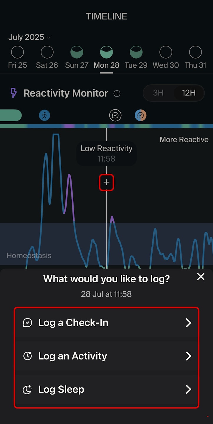
+ Icon: When hovering over a section of any graph, a “+” icon appears. Tap it to log one of the following:
Learn more about the meaning of each graph — Reactivity Monitor, Heart Rate (HR), Steps, and Motion (iOS only) — and how to interpret them by clicking below.

