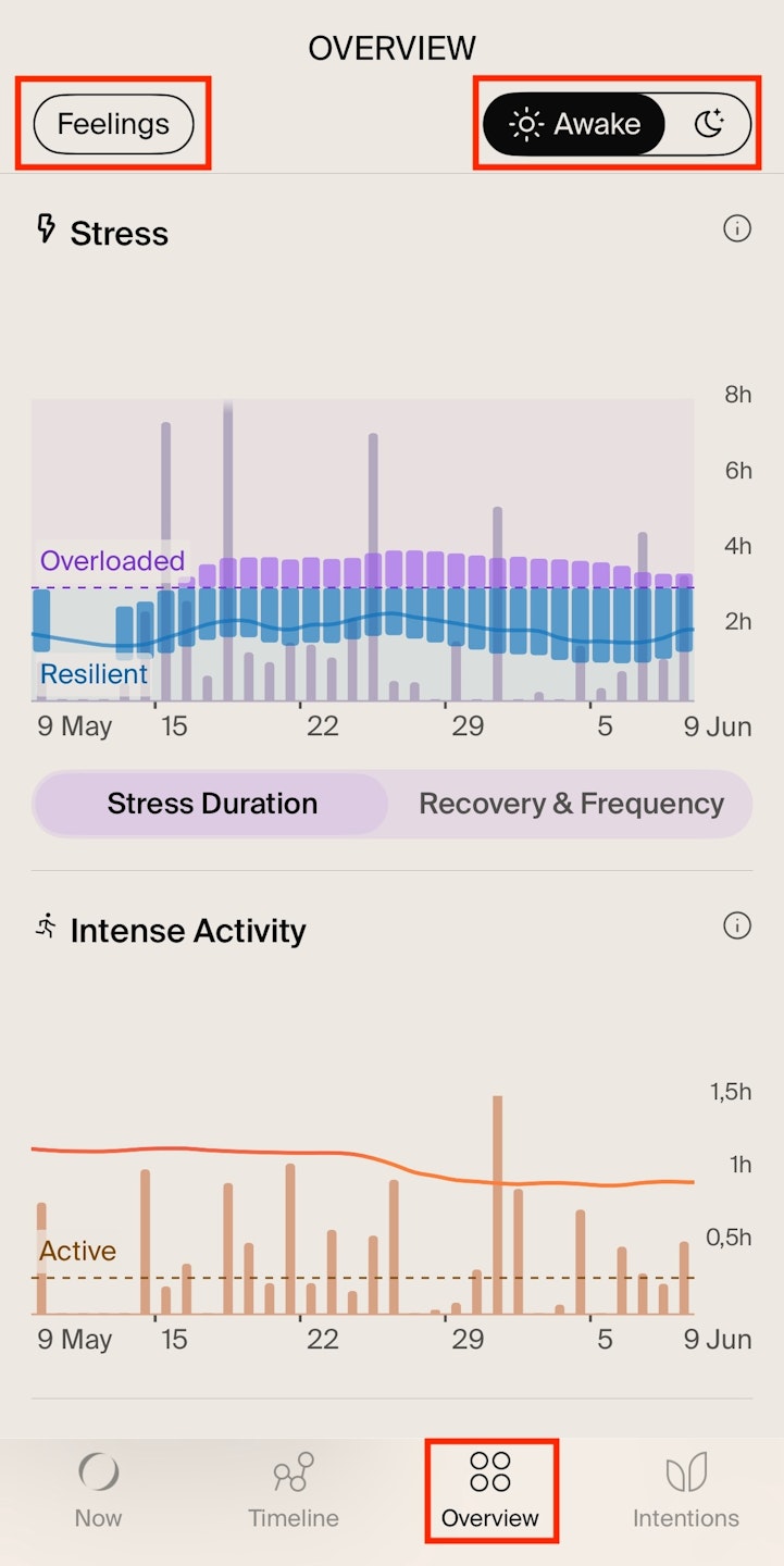


About the Overview Screen
The Overview Screen provides a clear view of your health metrics, such as Stress, Active, Heart Rate, and Sleep, helping you identify trends and areas for improvement.

How to navigate the Overview Screen
Open the NOWATCH app and tap the Overview tab (third tab).
Sun icon (top-right corner): Tap to view your awake metrics (Stress, Activity and Resting Heart Rate).
Moon icon (top-right corner): Tap to see asleep metrics (Sleep Duration, Sleep Regularity, Heart Rate Variability).
Feelings tab (top-left corner): Tap to track how you’ve been feeling each day. What you see here is based on your responses to the daily check-in questions—like “How was your day?” and “How did you sleep?”—which appear in the morning and evening.
If any icon is filled with white, it means you're currently on that tab.
Awake metrics (sun icon)
Under the sun icon, you’ll see the data from when you are awake, namely your: Stress, Active, and Resting Heart Rate.
Each metric has its own chart with each bar representing the value for that day. Tap on any bar to see detailed data for that specific day. Keep in mind that stress has two different charts: Stress Duration and Stress Recovery & Frequency.
Additionally, each chart includes a brief description to help you understand what it shows and how you're doing.
Asleep metrics (moon icon)
Under the moon icon, you’ll find three main metrics: Sleep Duration, Sleep Regularity and Heart Rate Variability (HRV).
Each metric has its own chart with bars representing the nights. Tap on any bar to see detailed insights for that specific night.
You'll also notice the stress-related chart at the top. Please keep in mind that this chart is part of your awake metrics, not your sleep data. However, you can still see how your sleep relates to your stress. We look at your health through the lens of stress—so this view helps you understand how your activity and sleep impact your stress, and ultimately, how you feel.

Stress Duration
Stress Duration: Measures how much time your body spends in a reactive state due to stress each day. Your daily Stress Duration is influenced by Stress Frequency and Stress Recovery. Find more details about each of these metrics bellow.
Typical: Shows how your body is doing over time. If it is changing, it may indicate you feel overwhelmed and need to take action to reduce your Stress Duration. Note: This is the key part of the chart to keep an eye on.
Reflection: Tap any bar for a personalized daily reflection.
Chart Interpretation
Grey bars: Show your Daily Stress Duration.
Purple bars: Represent your Typical Range.
Narrow range: Means consistent Stress Duration, indicating your body handles daily challenges well and supports better health.
Wide range: Means fluctuating Stress Duration, which may suggest your body needs extra support for better health.
Purple line: Represents your Typical Stress Duration. A high typical indicates your body might be under more pressure that it can handle, while a low typical may signal fatigue or lack of motivation.

Stress Recovery & Frequency
Stress Recovery: Refers to how quickly your body returns to calm after stress.
Stress Frequency: Tracks how often you experience stress throughout the day.
Both are more important for your health than stress intensity alone. The faster you recover, the better you handle daily challenges and maintain health. Your state of mind, physical activity, sleep quality and eating habits can influence how quickly your body recovers from stress and how often you may experience it.
Chart Interpretation
Grey bars: Show Daily Stress Recovery.
Purple bars: Indicate your Typical Range of Stress Recovery. It shows daily changes in Stress Recovery:
Narrow range: Means consistent recovery, however if it takes over 30 minutes regularly, consider adjusting your routine to recover faster.
Wide range: Means inconsistent recovery, indicating your body may struggle to maintain balance and is more sensitive to stress.
Purple line: Represents your Typical Stress Recovery, which shows changes over time.
Circles at the bottom: Represent Daily Stress Frequency.
Small circles: Low Stress Frequency (less than 3 stress responses).
Medium circles: Medium Stress Frequency (3 to 5 stress responses).
Large circles: High Stress Frequency (6 or more stress responses). This doesn’t necessarily mean more stressful events; it could indicate heightened sensitivity to stress at that time.

Active
Active refers to any movement, from a workout to a long walk- as long as you hit Heart Rate (HR) Zone 2 or higher.
Daily Active Time: Tracks how long you’re physically active each day. Moderate activity done regularly, four to five times a week, benefits your health more than occasional intense workouts.
Typical Regularity: Shows how consistently you stay active. Reaching 15 minutes in HR Zone 2 or higher counts as an active day and contributes to your regularity.
Chart Interpretation
Grey bars: Represents your Daily Active Time.
Line: Represents your Regularity, and here's what it shows:
Regular: You're hitting at least 15 minutes of activity on most days. Regularity is within the highlighted area.
Irregular: Your activity levels fluctuate, with some active days and others with less movement. Regularity is slightly below the highlighted area.
Inactive: You're getting less than 15 minutes of activity on most days, missing out on key health benefits. Regularity is well below the highlighted area.
Highlighted area: Represents the zone where you should aim to maintain your Regularity (in other words, aim for at least 15 minutes in Heart Rate Zone 2, 4 to 5 times a week), as recommended by the World Health Organization (WHO).

Resting Heart Rate (RHR)
Resting Heart Rate (RHR): Measures the number of times your heart beats per minute when relaxed and still, while being awake. For most adults, a normal RHR ranges from 60-100 beats per minute.
Daily RHR: Reflects your average Heart Rate at rest throughout the day. It’s usually measured while you're sitting still or right after waking up in the morning.
Lower RHR: Often indicates better cardiovascular health.
Higher RHR: May signal stress, illness, or lack of sleep.
Typical Range: Represents your personal baseline for Resting Heart Rate, which is based on the lowest 10 minutes of rest recorded while you’re awake, sitting still, and not moving.
Chart Interpretation
Red dots: Represent your Daily RHR.
Highlighted area: Represents your Typical Range, the current normal range for your Daily RHR.
Daily RHR within or below your Typical Range: Means your body is functioning efficiently.
Persistent Daily RHR above your Typical Range: Means your body may need extra attention.

Sleep Duration
Daily Sleep Duration: Tracks your total sleep time each night, helping adjust habits for better health. While needs vary, most adults benefit from 7–9 hours.
Typical Sleep Duration: Shows your Sleep Duration over time. Consistently getting too little or too much sleep can affect your health. A regular Sleep Duration helps maintain your body’s natural rhythms and overall well-being.
Chart Interpretation
Grey bars: Represent your Daily Sleep Duration. When tapping on a bar you’ll see your Sleep Duration on the right, and your Typical on the left. Tapping the arrows below reveals the percentage of time spent in each sleep stage: Light, REM, Deep, and Awake.
Line: Represents your Typical Sleep Duration.
Highlighted area: Represents the recommended Sleep Duration Range for your age, as suggested by the National Sleep Foundation:
18-25 years: 6-11 hours
26-64 years: 6-10 hours
65+ years: 5-9 hours

Sleep Regularity
Sleep Regularity: Tracks how consistently you maintain your bedtime and wake-up time. Occasional changes are normal, but a stable schedule supports your natural rhythm and health. Keeping regular sleep hours is one of the best ways to improve sleep quality.
Awakenings: Number of times you woke up during the night.
Chart Interpretation
Green bars: Represent your Daily Sleep Regularity.
Line besides moon icon: Represents your typical bedtime.
Line besides sun icon: Represents your typical wake-up time.
Area between the moon and sun icon lines: Represent your Regularity Zone.
Regular sleep: Green bars are within the moon and sun icon lines.
Irregular sleep: Green bars are outside both icon lines.
White bars within your Sleep Regularity: Indicate your Awakenings (number of times you woke up during the night).

Heart Rate Variability (HRV)
Heart Rate Variability (HRV): Measures the variation in time between heartbeats during sleep, reflecting how well your body recovers overnight.
Sleep HRV: Tracks your average HRV during sleep, which could mean how well your body recovers overnight.
Typical Range: Reflects your typical or average range.
Chart Interpretation
Blue dots: Represent Sleep HRV.
Higher sleep HRV: Indicates better recovery, leaving you mentally and physically ready for the day ahead.
Lower sleep HRV: Suggests your body is struggling to recover effectively.
Temporary dips in Sleep HRV are normal, but consistently low values may mean your body needs extra support. Consider resting more, improving sleep hygiene, managing stress, or adjusting your exercise.
Highlighted area: This is your Typical HRV Range, the target zone for your Sleep HRV.
Tracking your Sleep HRV against your Typical Range helps you understand how well your body is recovering and recognize when you might need additional rest or support.
Keep in mind that HRV is highly individual - what's considered "low" for one person may be normal for another. The key is to observe patterns in your own HRV trends over time rather than comparing them to others.

Feelings
Each day, you'll receive two questions in the app:
"How was your day?" at the end of the day
"How was your sleep?" when you wake up in the morning
Your responses are reflected in the Overview, where the colour of your selected answer overlays the bar for that day.
Your response to the day question appears as a colour overlay on the Stress Duration, Recovery, Frequency, Activity, and RHR charts.
Your response to the sleep question appears on the Sleep Duration, Regularity, and HRV charts.